
Should You Be Afraid Of Designing With Color?

Some people might think even a small amount of color in their home is too much. (Image courtesy of Armony Cucine)
We seem to be surrounded by an ever-present ocean of worn and aged oak, walnut for miles, gray-weathered barn wood siding and enough white to cause blindness. Are we afraid of color? Adding some color into our lives might be a way to both lift our spirits and provide ways to express more personal character. Another benefit to embracing a more color-filled environment is it will set someone apart from the neutral-madding crowd.
In my career as an interior designer, I’ve been 100% neutral about color. If that is hard to believe, consider that to be successful in helping people create spaces that nurture their souls, be it at work or at home, in a restaurant, retail store or church - color has to be selected and specified for the user, for the customer. While a specific color may not be my personal jam, if it is the right design decision, I’ll execute the composition of that space to allow for the best rendition of that color within that envelope.

If the craving is for yellow, it is in balance when tempered by neutral colors, especially both light and dark tones. (Image courtesy of Koinor International)
An early influence to my interest in color was a psychologist named Tony Torrice, who, along with his business partner, Ro Logrippo, co-authored "In My Room: Designing For and With Children". Tony’s theories about "co-designing” environments with kids are detailed in the book. One of them left an indelible mark on me. One of Tony’s patients was a 5-year-old child who was never able to speak, not one word, but could understand the world the same as any other child of that age. No physiological malady could be determined as to the reason this was happening.
On a hunch after studying Kirlean photography and by extension the seven chakras, Tony got a paint color deck and opened it up so he could show the child all of the colors. He then asked the child to select one color to be painted onto the child’s bedroom walls. A blue-green was selected and the walls were painted. Right before the walls were painted, Tony took a Kirlian type aura photograph of the child.
Over a few month period after the painting was completed, Tony started talking to the child by way of a hand puppet. Soon, a sound escaped from the child, then a word then a couple of words, working alongside a speech pathologist. In short order, speaking became more comfortable. At that point, another aura image of the child was taken. The difference between the first and second images was startling.
In the first one, the area around the throat and just below was missing what normally shows up in an aura image - blue. It is typically seen there and is the color which relates to speaking clearly. Without that blue color one might be withdrawn and anxious. The color green is present on an aura image just below the throat. It aligns with self-love and good relationship communication. Less or missing green typically relates to depression.

Kirlian type photography, project by Rosenberg, M.I.T. Fab Lab
The child was missing the green color in the first image too. When the 2nd image was taken, there was more blue and more green seen on the image. Tony posited the theory that the child NEEDED to have those colors around him, to absorb them into his body to be healthy and balanced. It is believed that we do absorb color through our skin, as color is a light wave. This is only one example of how we are and can be affected by the colors around us - but it is hard to ignore the result of using the right colors!
Why do many people seem to have a fear factor around the use of color, either on the clothing they wear or surrounding them in their homes? Conversely, this is not the case when they are outside in nature...of course not! Mother Nature does it best - that is to say, in the right doses of proportion and intensity each and every time. Therefore, it stands to reason that to mimic natures ‘dosing ‘ of color and color relationships to each other, an interior space created by a lowly human person will have a better chance to succeed when approached with nature in mind.
‘Simple concept, really, but not easy to pull off. Most of what makes following color concepts found in nature difficult, is knowing when to quit. In other works, a little color goes a long way. It needs to be balanced or it does not ‘feel’ right.

This neutral space is saved by one thing - can you guess? Hint - cover up the entire glass door. (Image courtesy of Jesse Italia)
A look at history shows that not only did people use color for the objects they created to keep around themselves, they discovered it made their lives better. Over time, it was discovered how important color is to plants, insects, fish, birds, animals and human beings too.
Here is a basic chronology of who and what led up to our color understanding - the explanation of color. It was not until more recently, that the study of the conscious and subconscious reactions people have with color is more understood and reveals a lot about their relationship with color.
Color has played significant roles throughout human history. Ancient Egyptians used specific colors in their symbols and believed color contained magical properties which then transferred to any object a color was applied onto. While we think of ancient Roman statues as being executed in white marble, traces of vivid colored paint on them can be seen under ultraviolet light.
The Smithsonian Libraries note Aristotle developed the first known theory of color believing it was sent by God from heaven through celestial rays of light. He suggested that all colors came from white and black (lightness and darkness) and related them to the four elements – water, air, earth, and fire. Aristotle’s beliefs on color were widely held for over 2000 years until being replaced by those of Newton.
It was in the 1660s, when English physicist and mathematician Isaac Newton began a series of experiments with sunlight and prisms. He demonstrated that clear white light was composed of seven visible colors. By scientifically establishing our visible spectrum (the colors we see in a rainbow, also known as Newton’s Rainbow), he laid the path for others to experiment with color in a scientific manner. His work led to breakthroughs in optics, physics, chemistry, perception, and the study of color in nature.
The first systematic study of the physiological effect of colors, called ‘Theory of Color’ was developed by Johann Wolfgang von Goethe in 1810. He challenged Newton’s views on color, arguing that color was not simply a scientific measurement, but a subjective experience perceived differently by each viewer.
“Colour are light’s suffering and joy” - Johann Wolfgang von Goethe
As more nuanced information about color was sought, a test for color blindness (which affects about 4.5% of the population) was first devised by Professor J. Stilling, of Strassburg in 1876 and was published in 1883. These tests were pages with numbers or shapes set against a potentially confusing coloured background. The most famous of these types of tests were hand painted in watercolor by Ishihara Shinobu, a Professor of Ophthalmology at the Imperial University of Tokyo. In 1917 his third set of color blindness texts were published internationally and are still in use by most ophthalmologists today. The findings, which still hold true, show 99% of people with color blindness have trouble differentiating between green and red. The scale is tipped heavily towards men with this condition: approximately 1 in 12 men versus 1 in 200 women are color blind.

Colorblindness test card, one of the set of thirty-six, watercolor by Ishihara Shinobu
There is a wide range of estimates on the total number of colors a person can see. Even the lowest number is a lot, at one million. Average number estimates are in the eight to ten million range, but can be up to 100 million different perceived colors in some people. I postulate for this reason alone that we should not be afraid of using color in our spaces - we were designed to see a glorious world of wide-ranging colors!
According to Faber Birren (1900-1988) a practitioner in the color industry who produced 25 books and scores of articles, including peer-reviewed journals, he takes into account the eye’s ability to distinguish more warm than cool colours, which are therefore granted greater importance in art and and on his color circle wheel, although there are 35 Color Order Systems preceding his, and 17 of them after his Birren Color Circle Wheel System.
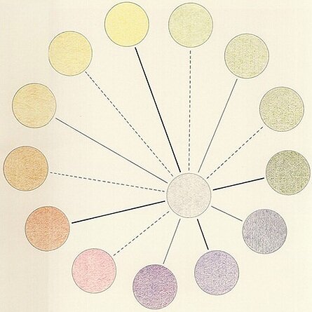
Birren’s Color Wheel Circle - Warm Tones Are Preferred
Giving credence to Birren’s assertion that more of the population prefer warmer color tones, on page 111 in his ‘Color and Human Response’ book, he cites the work of E.R. Jaensch, in a study published in 1930. This German psychologist put forth the theory that people prefer colors that are more predominant to the light wavelength and colors which are around them, based upon where on the latitude of the earth they happen to live.
A couple of examples are that brunettes, typically Latins who have dark hair, dark eyes and darker complexions, have a natural predilection for reds and all warm hues because they have learned to accommodate for the longer waves of light spectrum found closer to the equator, colors in the red range. Nordic inhabitants generally have blue-ish eyes, light hair and light complexions. They prefer blues and greens, which are the light wavelengths closer to the North Pole.

When selecting multiple colors, they are best accepted and appreciated when they have similar intensity. (Image courtesy of Herman Miller)
When workplace productivity began to be addressed by the design community in the 1970s, Herman Miller interviewed 360 companies that had changed or used color in their offices. They found the ‘right’ color schemes can reduce fatigue and reinforce certain workplace patterns and behaviors. Not surprisingly the research found:
Red - overstimulates and raises blood pressure, but also creates a feeling of physical warmth
Black and Brown - unless used as accents, decrease the perception of light and create feelings of fatigue
White - harder on people who work in front of screens, but increases the feeling of light and space
Blue - is relaxing and decreases blood pressure, unless overused, which could be depressing
Yellow - stimulates and raises spirits but can cause eyestrain in certain applications
Green - a quiet and refreshing color and has a calming effect
A confirmation of the Herman Miller report, is a study by Patrick Valdez and Amirhossein Mehrabian in The Journal of Experimental Psychology in 1994, which investigated Emotional reactions to color hue, saturation, and brightness (using Munsell Color System and color chips). Saturation and brightness evidenced strong and consistent effects on emotions. Blue, blue-green, green, red-purple, purple, and purple-blue were the most pleasant hues, whereas yellow and green-yellow were the least pleasant.
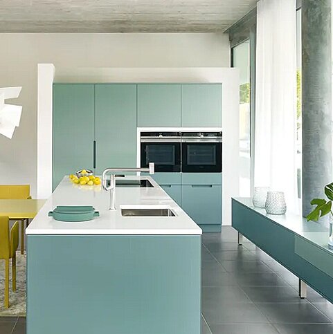
White Dekton counter balances the complimentary yellow and teal in the room. (Image courtesy of Cosentino)
Color is a fundamental element of environmental design. It is linked to psychological, physiological, and social reactions of human beings. In 2004 the Coalition for Health Environments Research identified 3,000 citations attributed to color theory which could have had supportable design implications for the use of color in healthcare design. A part of the 'Color in Healthcare Environments, A Research Report' study was separating common myths and realities in the research and application of color in healthcare design. This was done in an attempt to formulate universal guidelines for appropriate colors in healthcare settings, however due to thousands of variables between patient’s experiences, any potential guidelines was deemed to be ineffectual to outcomes as a whole.
To attain excellence in color design will most likely remain part art and part science - with the emphasis on art. Much of art stems from intuition, which is similar to designing with color. That is to say, it is the ability to understand something immediately, without the need for conscious reasoning. It is a basic way to describe our immediate and visceral reaction to colors.
When we trust and allow ourselves to be open to living with color, we’ll gravitate naturally to what is pleasing, what we need to keep around ourselves. Trends come and go. That is what occurs in a free market society. That colors are ‘marketed’ to be in favor or to be ‘Colors of The Year’, is only a celebration of color - not a prescription for what one must do to be ‘in style’. That is really ‘in copy’. Style is what you have - not what you copy.
The next time you begin to think about what color(s) a room should be, or an entire home or commercial space, trust in both yourself and your interior designer to land you in the sweet spot of the perfect color combination. No designer? Then just do your best...color is life - don’t be afraid of it.